ILLUSTRATION WORK FOR
broad creative
agency
BROAD CREATIVE
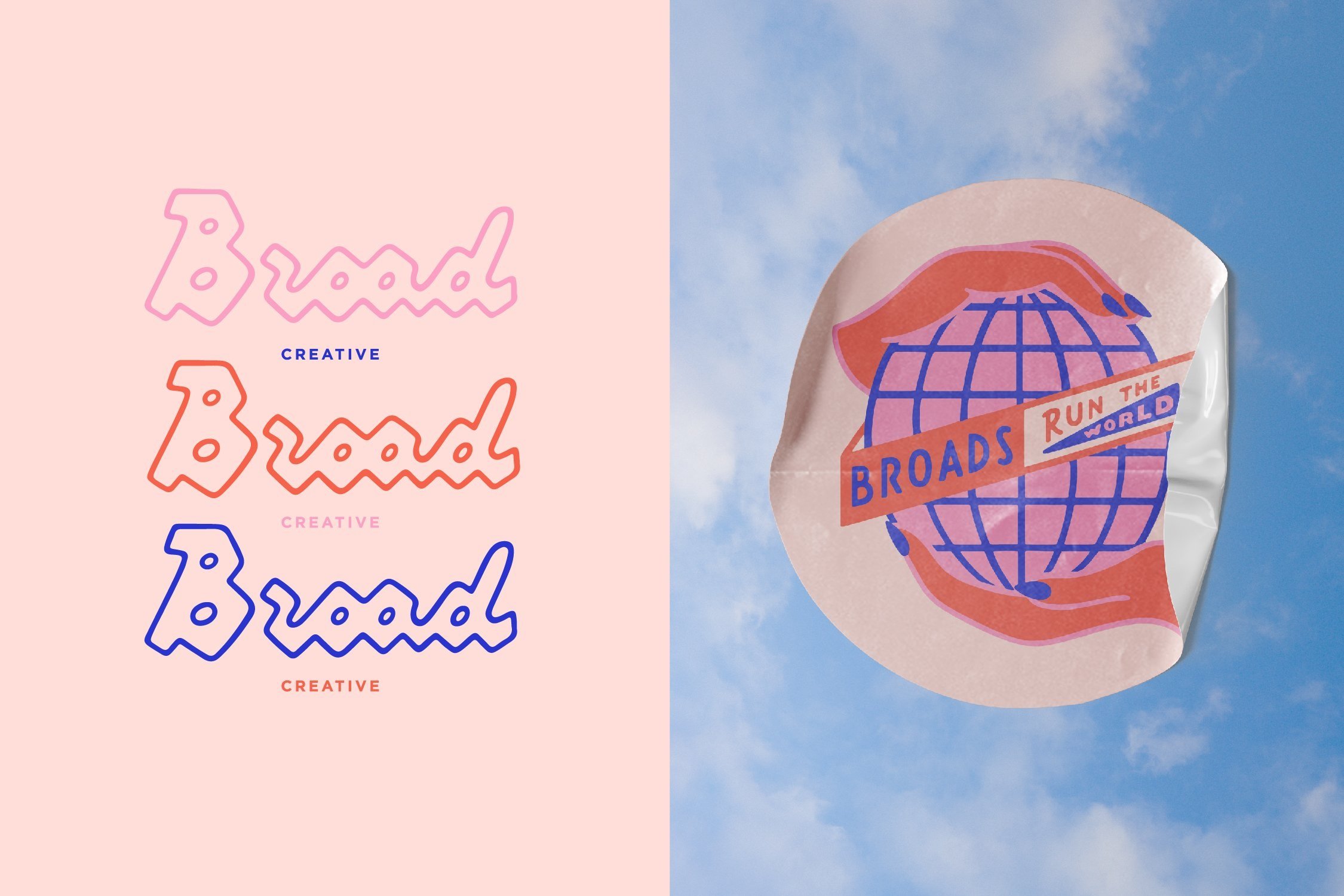
The goal for this project was to come up with some illustrative marks that could be implemented by the boutique agency across website, socials and various branding materials.


Primary notes to hiT included conveying a feminine touch, A FEW nods to Philadelphia and keeping things fun and light.

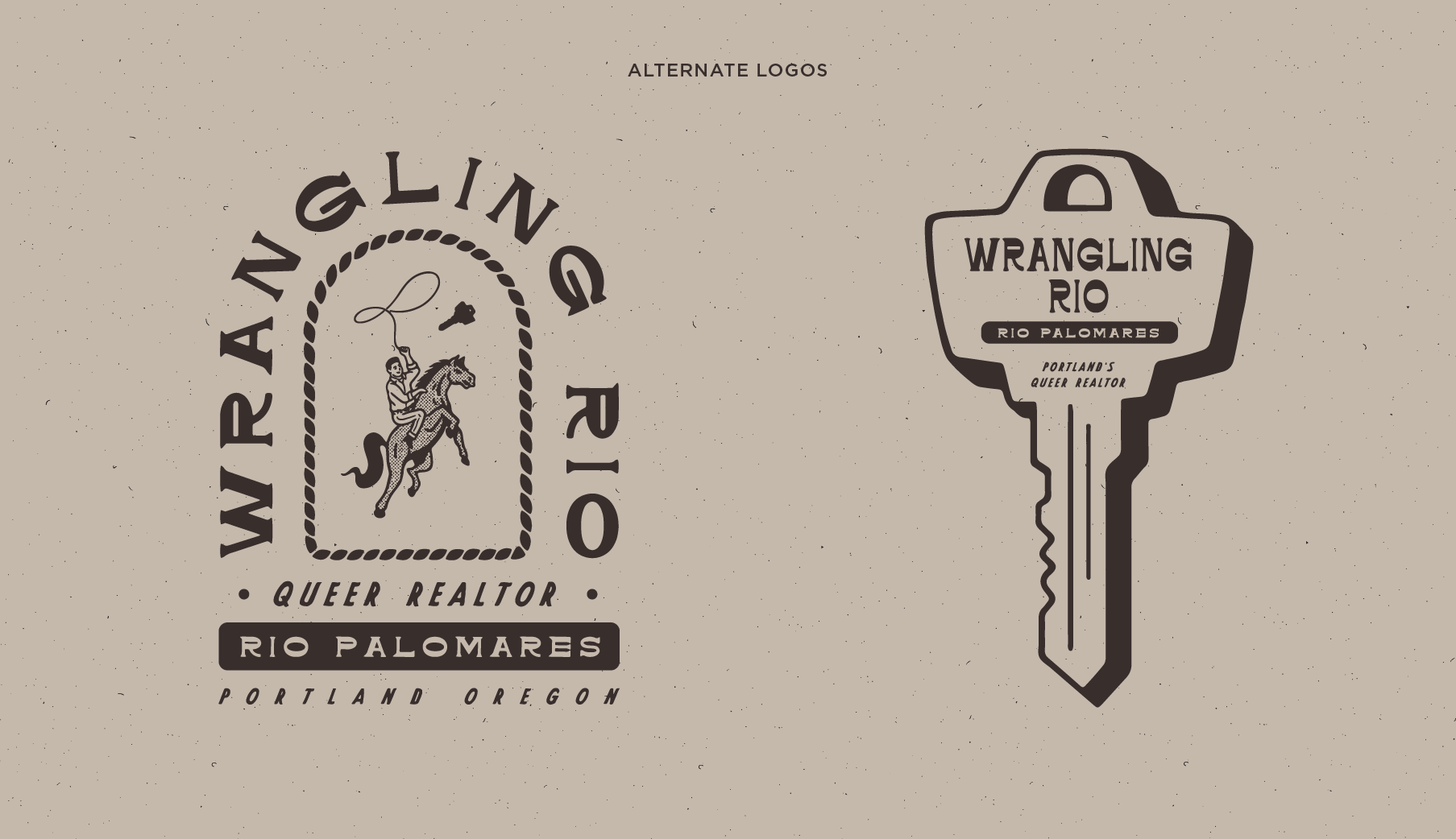
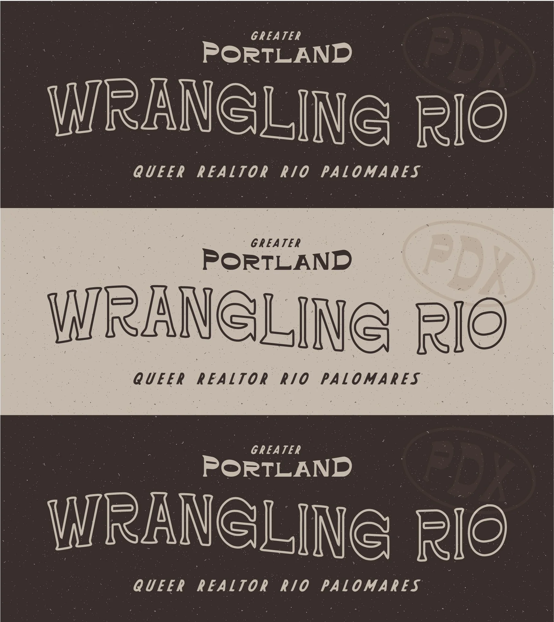
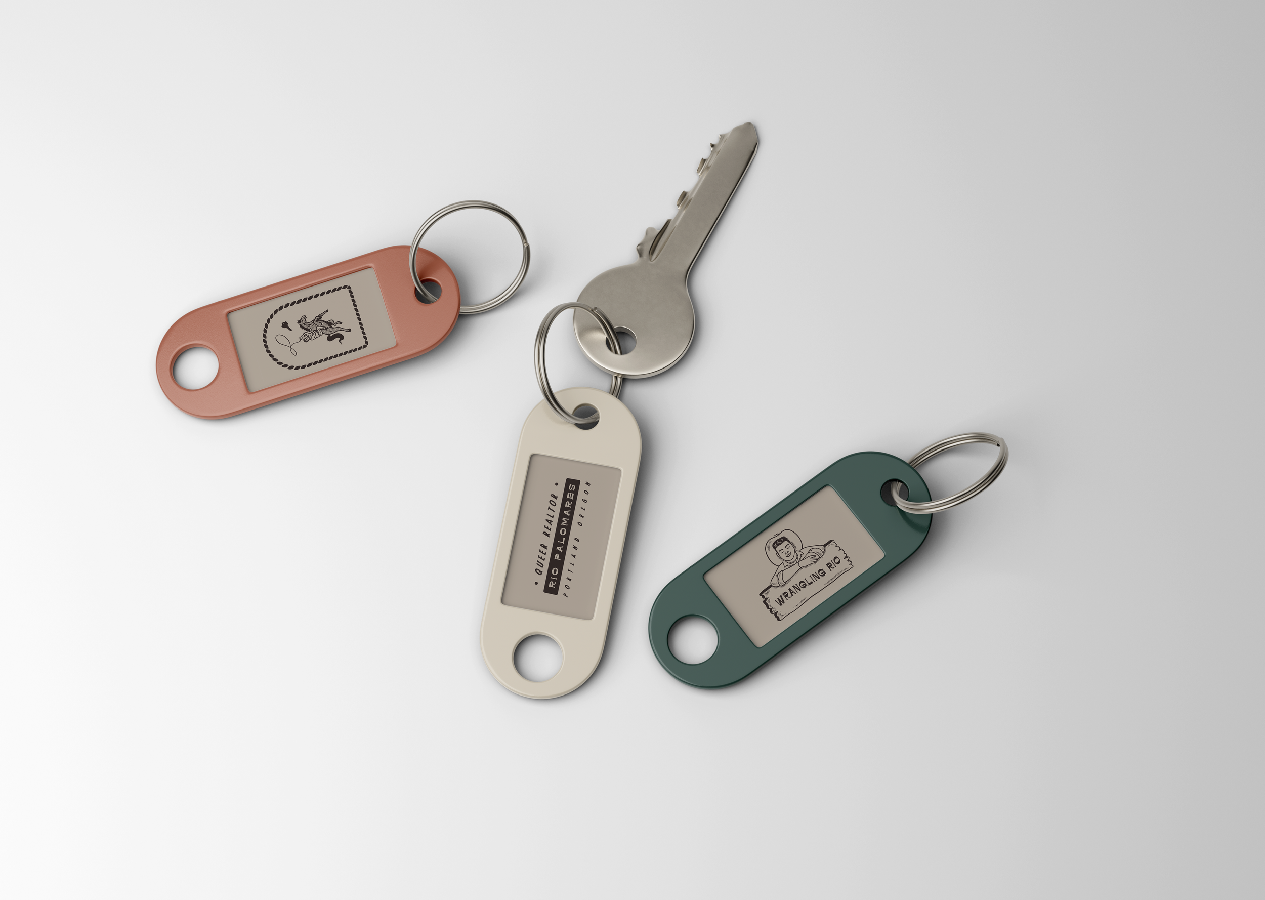
Wrangling rio
BRAND BUILD FOR

Logo creation for a Portland based real estate agent. The brand strategy for this project centered around invoking a welcoming queer cowboy western vibe. The primary logo includes the likeness of realtor Río leaning on an old wooden sign for a relaxed, inviting tone. The waving type to emphasize the “wrangling” aspect by mimicking the movement of a lassoing rope. Tying it all together with a paired down earth-toned color palette and some texture adds to the vintage western feel. Deliverables included a primary logo and secondary marks to be used in branding and promotional materials.

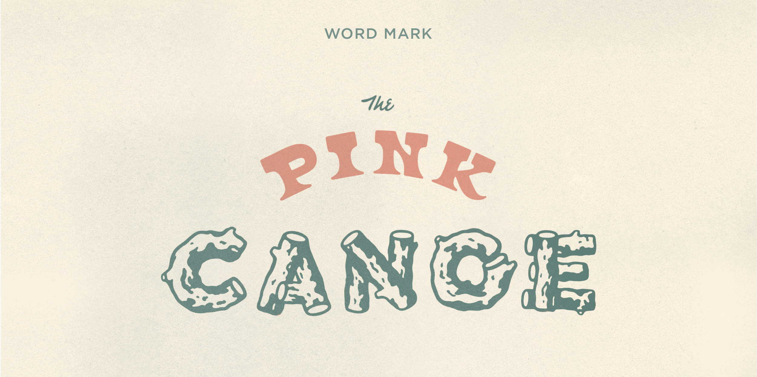
Brand identity build for bar concept,
The Pink Canoe

conjuring the feel of a vintage summer camp, the wistful cowgirl beckons you to take a dip in the lake

For The Pink Canoe the client specifically wanted to conjure the feel of a hypothetical vintage sapphic summer camp. The process included creating custom lettering featuring elements both playful and referencing the natural world and the wistful cowgirl illustration welcoming you into camp. The color palette of bay leaf green, alluding to woodsy vegetation, off-white for an aged feel; And dusty pink hinting at the sapphic nature of the establishment.


Brine street
picklery

Illustrative marks made for a label refresh for regional, retail pickle brand, Brine Street Picklery. The mission was to create playful illustrations to add a bit more visual panache to the packaging while incorporating the brands working class Philly roots.

PHILLY BORN.
PHILLY BRINED.
After identifying Brine Street’s needs for this project we found our way to the the “barrel man” illustration. Playing up the scale of the barrel allowed for the addition of the call to action to “Save the brine for Picklebacks” a popular combo of a shot of whiskey with a pickle juice chaser served at bars across Philadelphia. The “Don’t forget the pickles” text felt like a great addition to the jar label serving as a fun reminder to grab a jar of vinegary accoutrement. The finger tied with string adding an air of the analog; back before iPhone reminders, when a string would work just fine. The non-uniform lettering referencing hand done signage of yore meant to give the brand an established feel. The pickle Heisman was an additional illustration mark that the client enjoyed so much that they had to have for use on various promotional items.


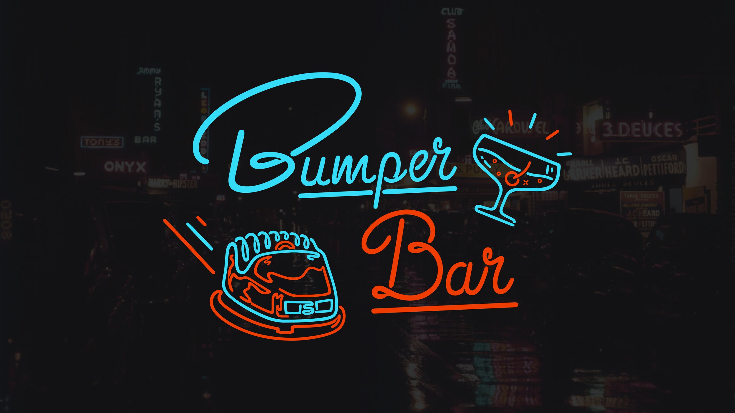
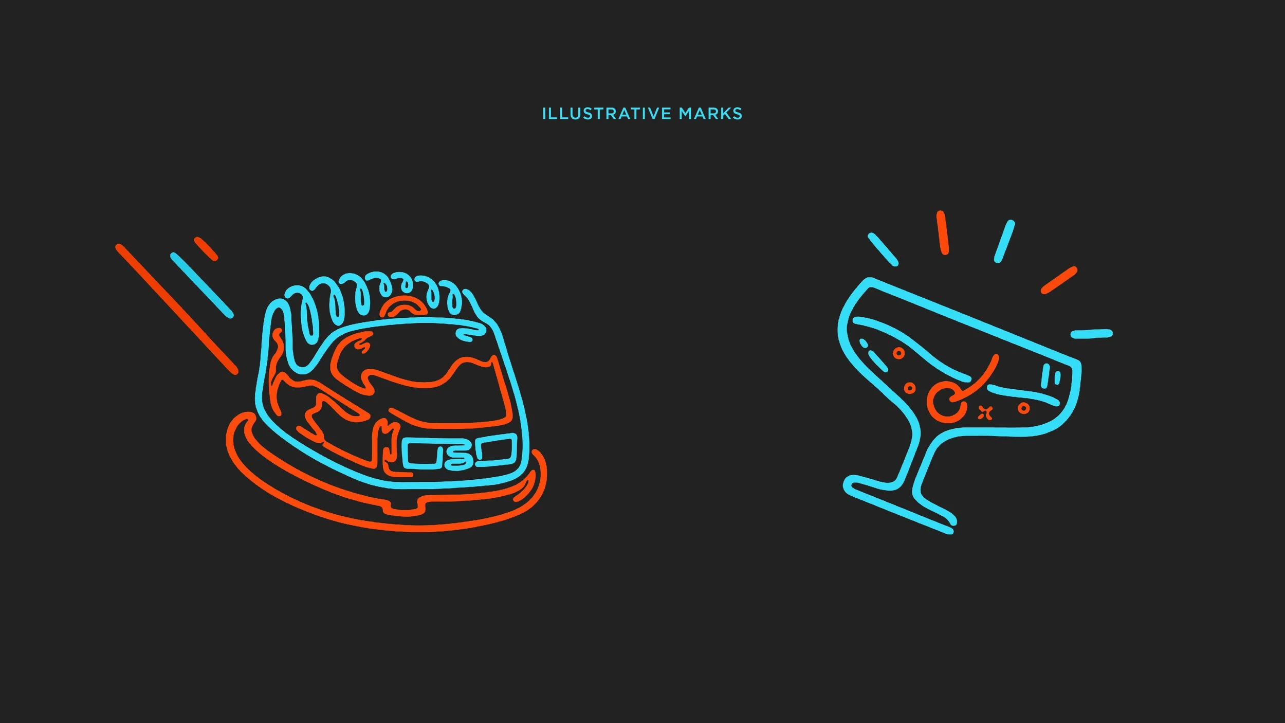
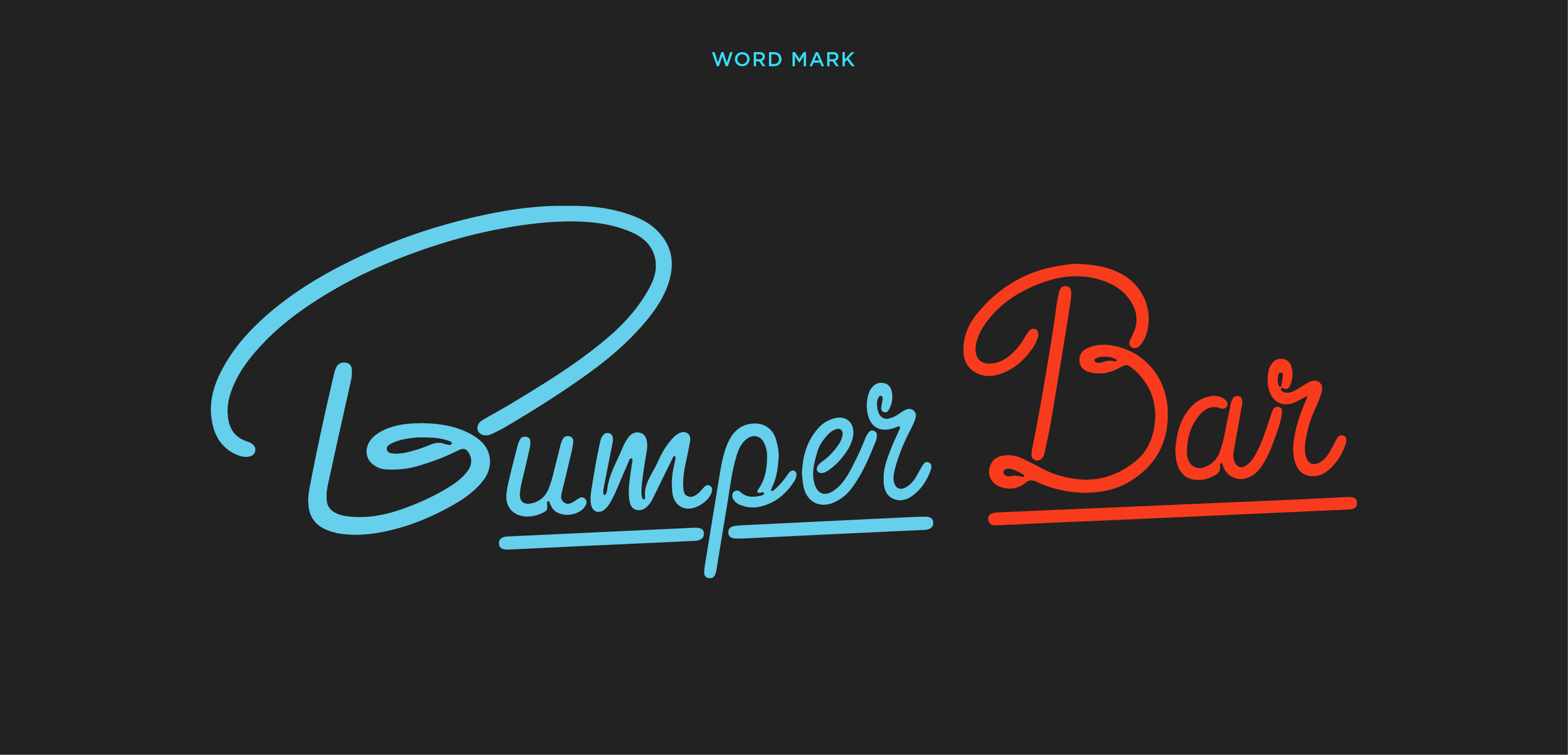
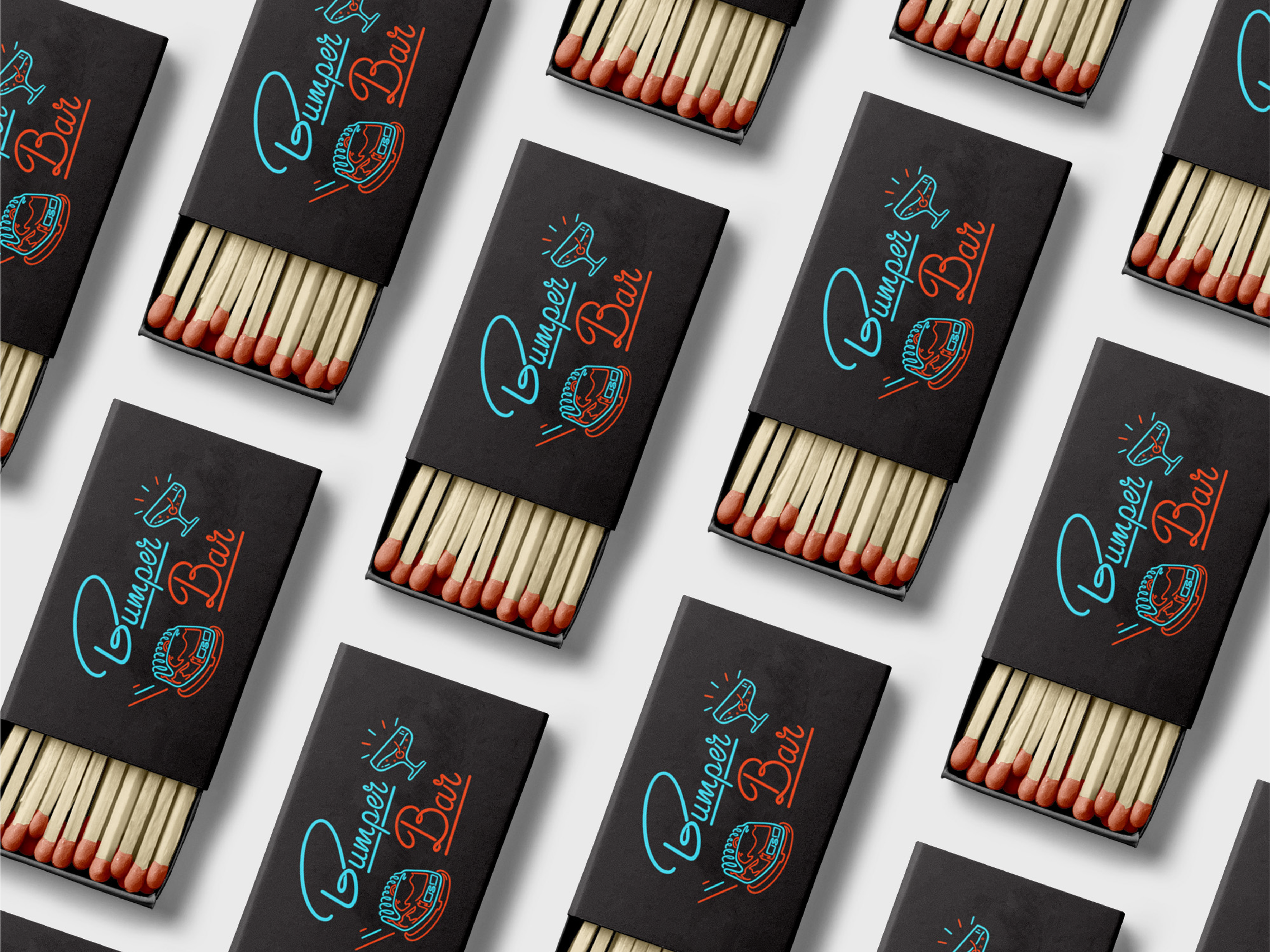
BUMPER BAR
LOGO DESIGN
A logo for a pop-up bar concept. Bumper Bar’s identity is equal parts cocktail bar and veritable adult playground. Lively cocktails and bar snacks in a high energy setting with a dash of retro arcade. Designed custom lettering and illustrations to mimic neon signs.
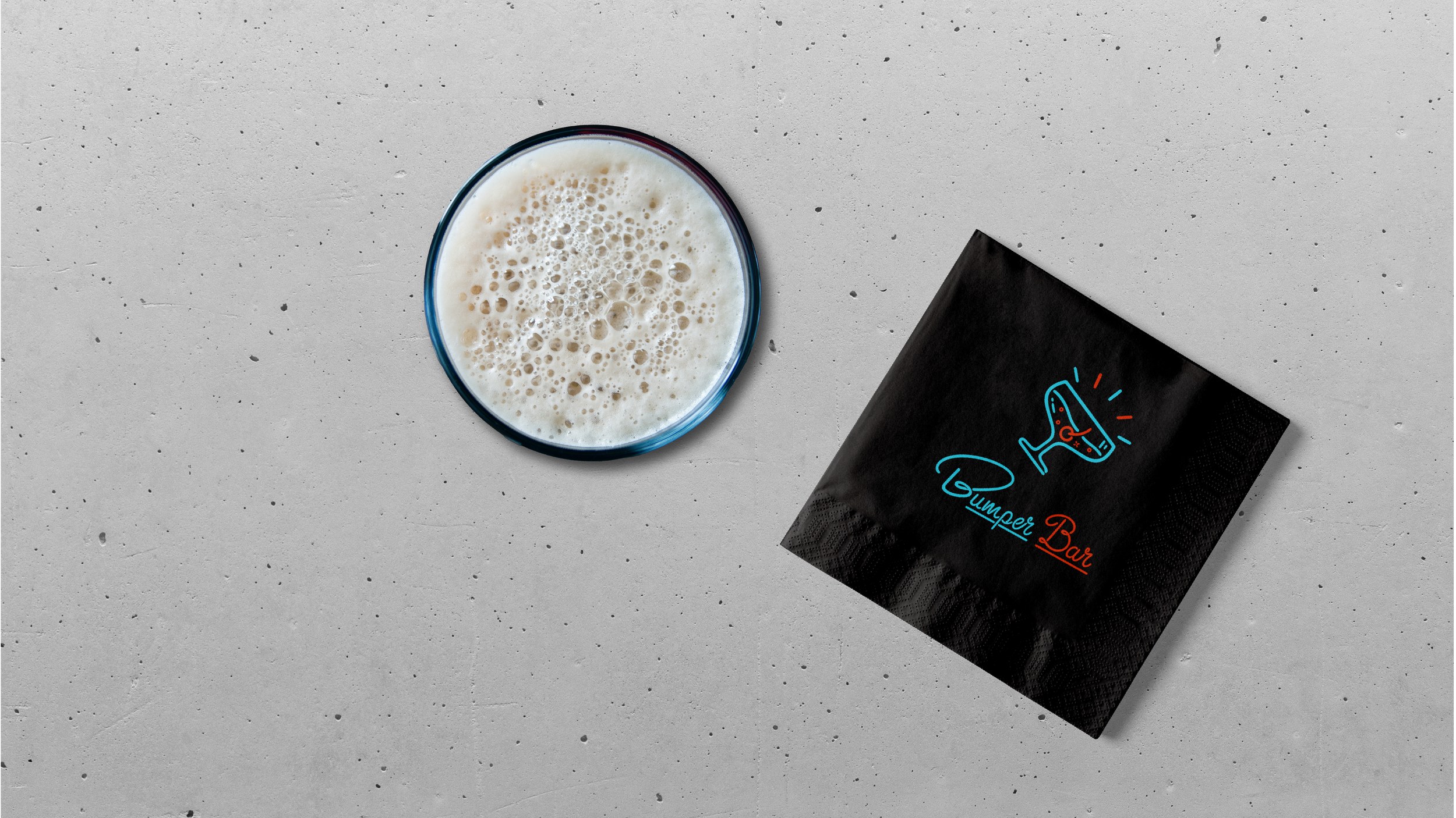
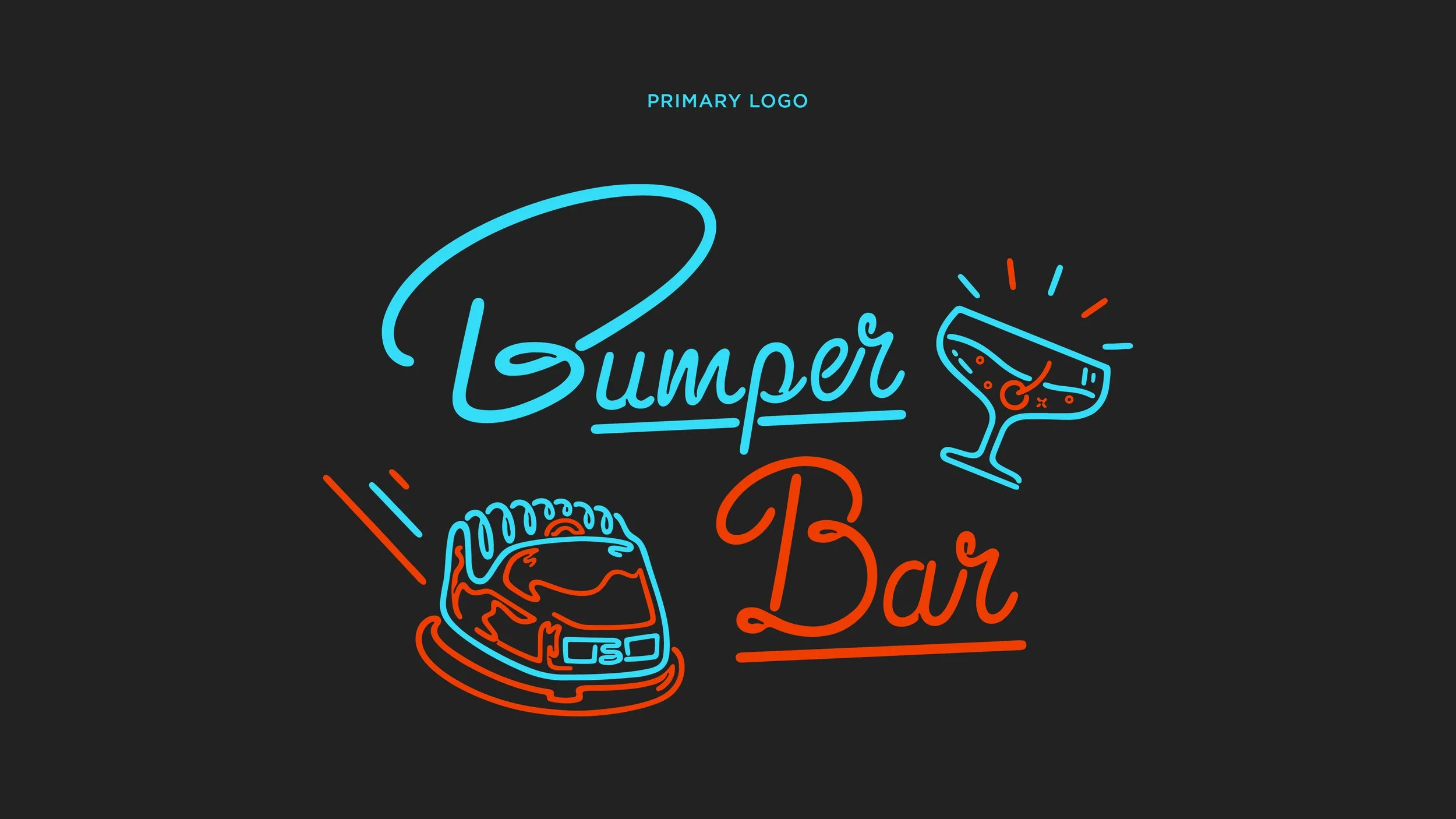
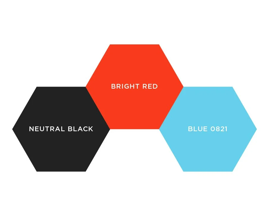
BUMPER BAR
COLORS
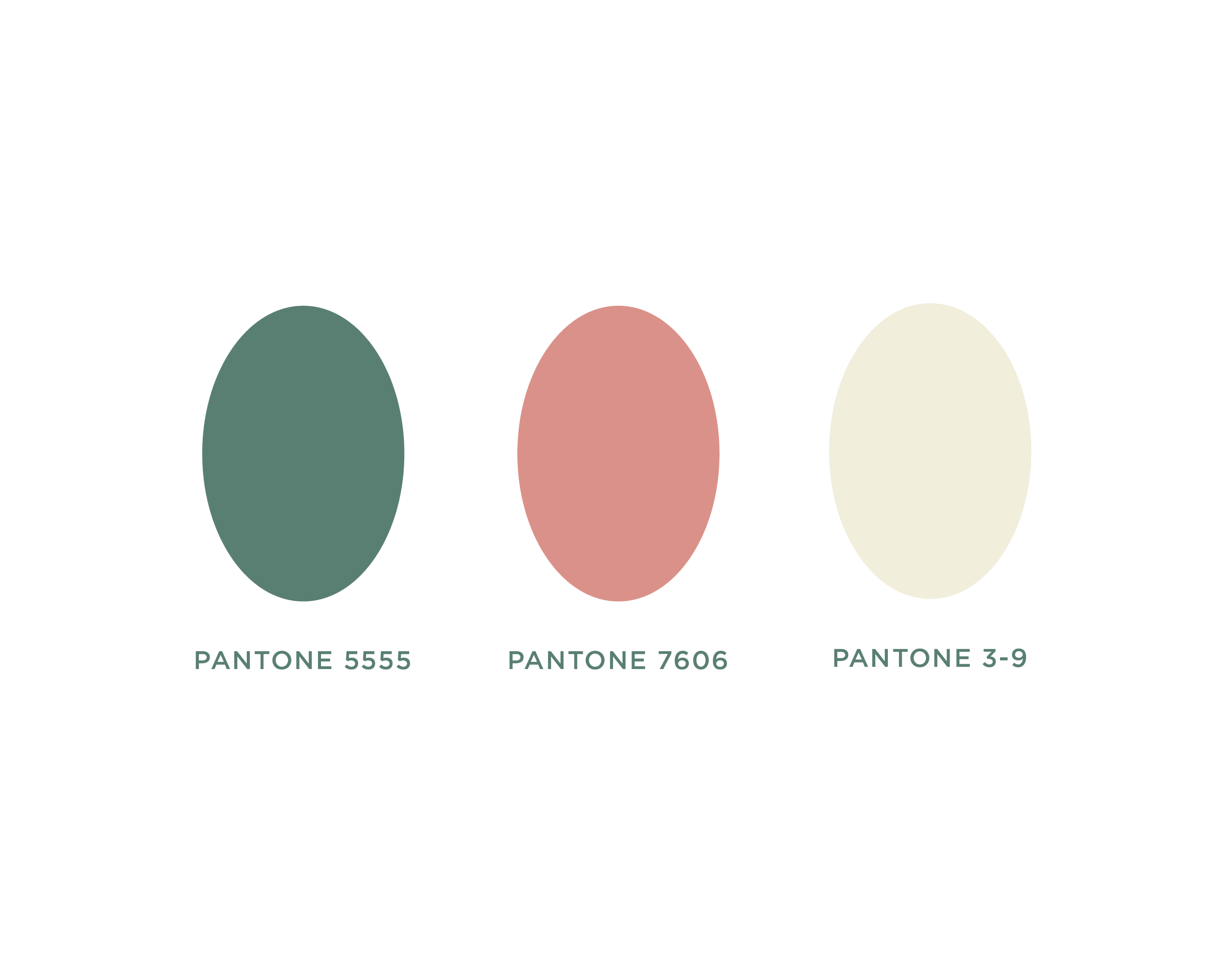
The colors were chosen to help add to the effect of classic neon bar signage with black providing the perfect background for the vibrant red and blue to pop.

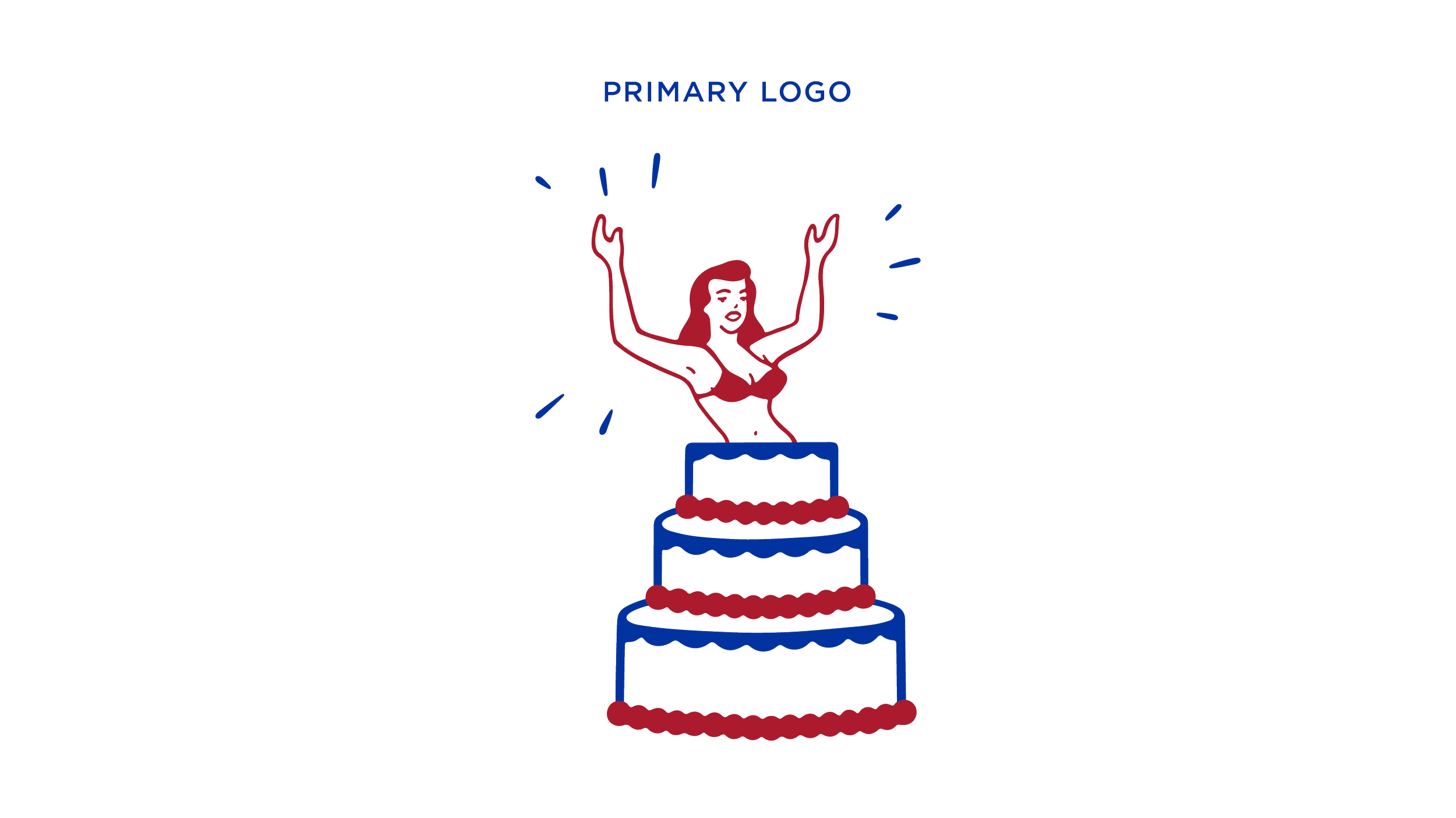
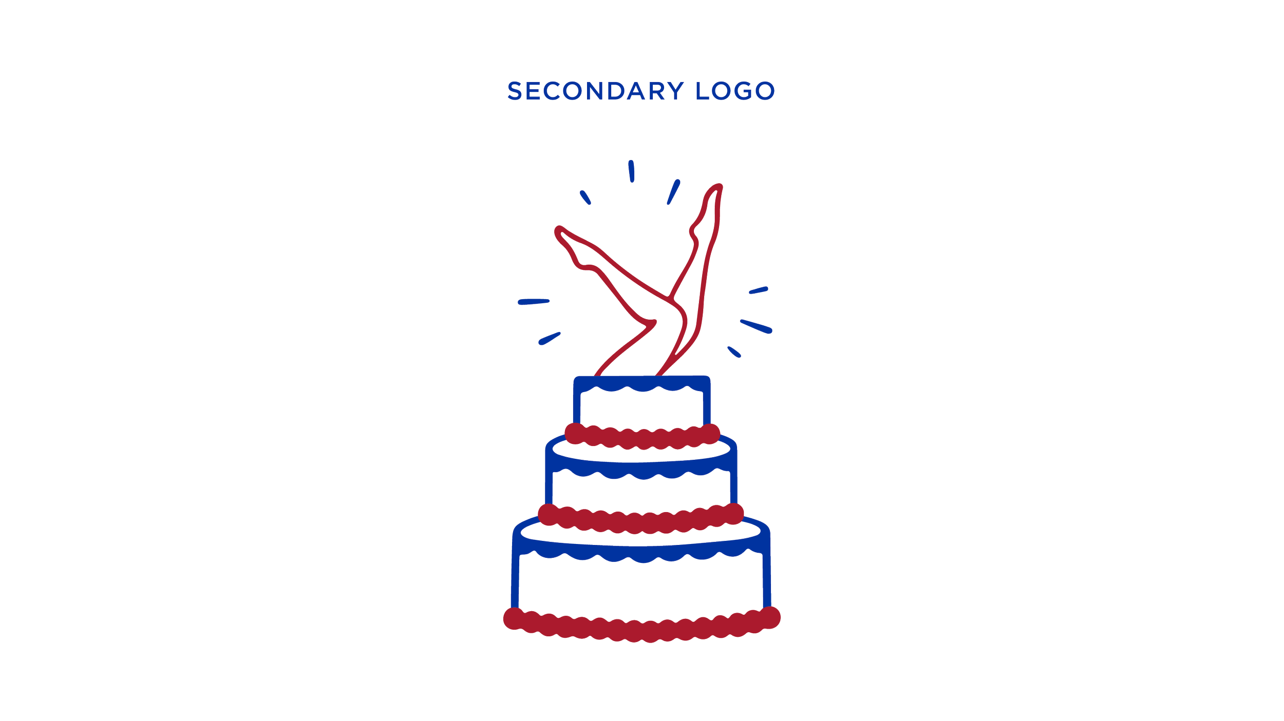
BRAND IDENTITY BUILD FOR
FREEDOM PIES BAKERY

Brand identity build including logo design and additional illustrated marks for boutique bakery business, Freedom Pies Bakery. Freedom Pies Bakery evokes a bit of Americana with a pin-up twist. Resulting in a primary logo featuring a lady popping out of a cake a cheeky nod to the bakery owner’s boisterous personality. The secondary logo mark featuring the same woman’s legs kicking out of the cake. The word mark is a hand drawn script with some simplified starburst that compliment the fire engine red and royal blue color pairing.